Understanding CSS Positioning part 3
In part one and part two we’ve discussed the positioning, display and floats properties of CSS2. In the final part of this series, we’ll discuss the new options CSS3 gives us: The advanced layout module and the grid positioning module.
CSS3 is built up out of individual modules. The advanced layout module and the Grid layout module both are quite similar, and it’s reasonable to assume that they get merged in the future (At least, I certainly hope so) or that they choose one over the other. Both fix the same problems: Multicolumn complex layouts like the ones that are currently possible in print (think magazines) but awfully hard to do with CSS.
The advanced layout module #
It is currently still a working draft, with the last revision made on august 9th of last year (2007). The main idea of the module is working with templates in which you include different “slots” for your content.
So for example, if you want to place two paragraphs next to each other, using the code below:
<div>
	<p class="first">some text...</p>
	<p class="second">some text...</p>
</div>
You can accomplish this with the following CSS:
div { display: "ab" }
.first { position: a }
.second {position: b }
Resulting in this image:
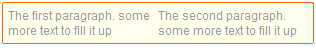
You can see that this changes the way both the display and position properties in CSS work. The current display property seems to have been renamed to display-role.
It’s a bit more powerful than the example above, you can declare multiple lines like so:
div { display: "aa"
	       "cd"
	       "ef"
}
See how I also have two a slots there? By placing the same letters next to (or under) each other you can create larger slots for your content.
However, you don’t always want text to be inside a specified block. you can use the value @ to denote “regular” flow content (so it will be in flow like described in part 2), and the . (period) to denote whitespace. This allows you to, for example, sprinkle your regular content with images placed in different places within the text:
div { display: "aaaa"
	       "...."
	       "@@@b"
	       "b@@@"
	       "@@@b"
	       "b@@@"
}
h1 {position: a}
img {position: b}
you can easily imagine aaaa being the header, having some whitespace below it, and images alternating left and right throughout the text.
Sizing it #
So, suppose you want to control the width and height of each slot, how would you do that? Simple, like so:
div { display: "a b" /1em
	       "c d" /2em
	       "e f"
		* 1em
}
The sizes on the right of the row denote the height of each row. If you don’t fill them in CSS will size it automatically. At the bottom you place the width for each column of slots. You can use the value intrinsic to let it’s contents determine the size or height. If you use * (asterisk), all rows or columns with an asterisk will be of the same height or width.
Positioning #
As you’ve seen in the example above, position allows you to pick a slot for your content. Using the value same it will pick the value it’s last sibling was using.
.first { position: a }
.second {position: same }
Using the same HTML as the first example, the above example would result in .second being in slot a as well.
Selecting #
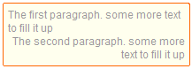
This module introduces a new pseudo-element named ::slot() that allows you to target a specific slot’s contents. you can use it like so:
div { display: "a"
	       "c"
}

div::slot(c) {text-align:right;}
Which will result in this image:
There are some more details, but if you really want to learn those, check out the specifications. Also realise that anything I’ve written above can change in the future.
The grid positioning module #
Last updated on the 5th of September of 2007, this module, made by two Microsoft employees, approaches the problem a bit differently.
You could say that while the advanced layout module merely wants to simulate more complex magazine or newspaper layouts, the grid positioning module tries to emulate them completely. It uses the properties columns, grid-columns, grid-rows and column-gap. It also introduces a new metric: gr. which is one ‘grid’ wide. it describes the width between two gridlines within an element.
Looking at the different properties, you can see that it does about the same as the advanced layout module, in that you define columns and rows (so, slots). The grid positioning module has a special property for column-gap, where the advanced layout uses regular ol’ padding and margin.
The other difference is that, while you have to specify all rows separately in the advanced layout module, you can use some more advanced syntax in the grid positioning module:
div {grid-columns: (1em 3em)[4]; }
The above code tells you that you have a sequence of a column of 1em followed by one of 3em, and those together are repeated 4 times. leaving out the number in square brackets, it will automatically generate as much columns as needed. If you want to write the above CSS without the fancy syntax it would look like this:
div {grid-columns: 1em 3em 1em 3em 1em 3em 1em 3em; }
You can do the same for grid-rows as well. Alternatively it offers a * value as well, where all columns/rows with the value of * will be sized equally. Something new however, is that you can also specify things like 2*, 3* and 10*, where the number will multiply the generated size.
Check out the quite readable (and illustrated!) specifications for more information. Note that this module as well is still far from finished and a lot of things need to be specified.
Floating #
I’ve written about the limitations of floating before, and it seems that CSS3 offers a module that answers my woes. There is however one caveat: The module, generated content for paged media currently targets only paged media (i.e., print). Luckily for us, it seems that the Grid positioning module wants to incorporate it into other visual media as well.
Just for a moment, think how awesome it would be to be able to do this:
img {
	float:page top left;
	float-offset: 4gr 1gr; /* 4 gridlines from the left, 1 from the top */
}
You can specify a vertical float position as well as a horizontal float position and you can use float-offset to specify where in the block you want float the image. This means you can have the text automatically flow around it at all sides, making it very easy to create magazine style layouts looking like, for example, the website Stuff and nonsense by Andy Clarke.
The end #
And with that the series on CSS Positioning comes to an end. It’s been a lot of fun for me to write these, and the resulting discussion and shared knowledge in the comments have been great as well. Thanks all!
 Hi, I'm Kilian. I make Polypane, the
browser for responsive web development and design. If you're reading this site, that's probably
interesting to you. Try it out!
Hi, I'm Kilian. I make Polypane, the
browser for responsive web development and design. If you're reading this site, that's probably
interesting to you. Try it out!