Understanding CSS Positioning part 1
Without a doubt, positioning, or the layout, is the hardest part of CSS. Not only because it ever so often varies between browsers, but also because CSS has a lot of ways to position an element, all with various (dis) advantages. This series of articles will thrive to explain the possibilities you have in positioning. It doesn’t only cover positioning, but also properties that define layout such as display and float, and a preview of the new CSS3 layout modules.
This part will introduce the positioning and display property. Part two, which will be published next week, will go more in-depth with the display attribute and delve into the float property. The last part, published the week thereafter will be a preview to the new CSS3 layout modules.
Display:hehwha?; #
Before we start, it is worth noting that there are basically two types of ways to display an element in CSS: block and inline.
Display:block; #
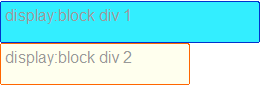
Block can be, quite literally, seen as a block. It has a specified width and height, optionally controlled by its content, but dimensions set by CSS have prevalence. Another property of elements with display:block is that they do not allow elements on the same “line” as their own. So while an element might have a small width, The next element will always be placed under it. So two simple divs with display block look like this:
Display:inline; #
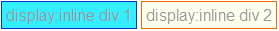
Display:inline is somewhat the opposite. Elements with display:inline always take their width and height from the contents, and will ignore any dimensions specified in the CSS. (Internet Explorer will, incorrectly, let you do this. Thanks NatalieMac!) Another opposite is that, as the name suggest, these elements are displayed in-line, so they will always be next to the preceding element, providing that the preceding element is inline as well and that there is enough width left. If the width of the “line” is filled, an element with display:inline will wrap to the next line. That looks like this:
That leaves display:none, which is really easy for me to explain: it doesn’t display. Which looks like…no I’m sorry, I’m not going to display images of nothing.
There is a multitude of other display: properties such as table and inline-block. I’ll talk about them in the second article, next week.
Flow #
With positioning, the elusive “Flow” of CSS positioning comes into play. The flow in CSS is the logical way in which elements get placed on your screen. For example, when you turn off the CSS on this page, you see the HTML in its original order. That order is the flow, and dictates which element gets rendered and placed where. It’s very simple: the flow of a page is from the top of the HTML to the bottom of it.
Positioning. #
One of the most misunderstood properties of CSS. This is partially because the display differs to wildly in different browsers, but also because the property is, in my opinion, misnamed. It’s not so much the position you declare, but in what way the element should interact with the elements around it.
Positioning also differs when you use the display property with it. The way positioning and display interact is a bit tricky: position:static and position:relative can be both display:block and display:inline, while position:absolute and position:fixed (and floats, more on that in the next article) will always be displayed as block elements.
We’ll start with the most simple positioning value, static.
Position:static; #
This is the basic positioning of an element and also the most simple one. An element with position:static fills the space its contents need. whether that is display:block or display:inline depends on the element’s standard display (for example, a <div> has display:block, while a <span> has display:inline) or on what you specify in your CSS.
Offsetting (using top, bottom, left and right) doesn’t do anything.
Position:relative; #
This value is very similar to position:static, with one vital difference: While a rendered element does get the width and height of the element, it doesn’t have to occupy the space designated for it. The properties top, right, bottom and left allow you to shift it away from that space. The offset here are the borders of the designated space. So for example, an element with position:relative and top:20px and left:20px; looks like this:
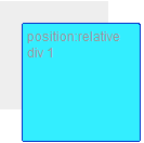
Where the grey part is the designated space.
The elements next to it in flow use the designated space as the “real” place of the element. So when you place a div right under the element pictured above, it looks like this:
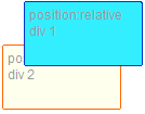
See how the positioned element sits above the one below it?
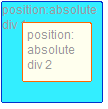
Position:absolute; #
Absolutely positioned elements are a very different beast altogether. The biggest difference is that an absolutely positioned element gets taken out of the flow. This means that it doesn’t interact with other elements around it. The elements around it pretend that the element just simply doesn’t exist.
The top, right, bottom and left properties do something vitally different as well: The control the offset from the first parent element that is positioned relatively or absolutely. Unless you have elements in your CSS with position:relative, position:fixed or position:absolute, this is the root element, which is <html>. In the specifications, this is called the “initial containing block“.
So an absolutely positioned element with top:20px and left:20px within a relatively positioned element looks like this:
There are some problems with positioning absolutely, this article by paul’OB describes them quite well.
A fun trick with position:absolute is defining top and bottom or left and right without defining, respectively, a height or width. Since the standard value of those is auto, the element will size to fill the space. Unfortunately this does not work in Internet Explorer.
Position:fixed; #
Fixed is somewhat of an unknown value, mostly because Internet Explorer 6 (thanks Laura!)does not support it. Fixed does essentially the same as position:absolute with one vital difference: It doesn’t take its offset from a parent element, but always from the viewport, your browser window. This essentially means that, when you scroll, the element stays visible and doesn’t move with the rest of the page. Forever taunting your efforts from it’s fixed positioning, smirking as your futile attempts to move it continue to fail…Sorry, I got carried away there. Anyway,
Z-index #
Another property coming into play with positioning is Z-index. This property allows you control which absolutely, fixed or relatively positioned element is placed on top. Z-index on any element without position:absolute, position:fixed or position:relative does nothing.
To understand Z-index, one bit of the specifications is rather important:
In CSS 2.1, each box has a position in three dimensions. In addition to their horizontal and vertical positions, boxes lie along a “z-axis” and are formatted one on top of the other.
This is called “Stacking”, and a number of elements stacked on top of each other is called a “stacking context”. I suggest you try not read the specifications on this, they are very technical and difficult to follow.
Worth noting though, is that every time you declare a Z-index, you create a new “stacking context”. This essentially means that any element within the current element will use the parent’s Z-index as a starting point. This is better explained with the following example. Using this CSS:
.relativeblock1 {
    position:relative;
    width:200px;
    height:80px;
    z-index:51;
}
.absoluteblock1 {
    position:absolute;
    left:10px;
    top:90px;
    width:40px;
    height:40px;
    z-index:1;
}
.relativeblock2 {
    position:relative;
    width:200px;
    height:80px;
    z-index:50;
}
And this HTML:
<div class="relativeblock1">
    <div class="absoluteblock1"></div>
</div>
<div class="relativeblock2"></div>
Then those two combined will give this image:
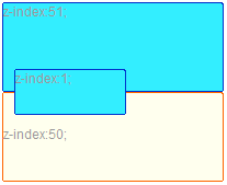
Can you see how, even though .relativeblock2 had a much higher z-index (50), it is below .absoluteblock1, which only has a z-index of 1? This is because .relativeblock1, with a z-index of 51, made a new stacking context where the z-index of .absoluteblock1 can be seen as “51.1”. For a more thorough explanation, read this article on stacking in CSS by Tim Kadlec or check Krijn Hoetmer’s test case.
This concludes the first part of the series. The next article in this series will be about floating and some of the more advanced uses of display. See you next week!
Update: part two of Understanding CSS positioning is posted, check it out!
 Hi, I'm Kilian. I make Polypane, the
browser for responsive web development and design. If you're reading this site, that's probably
interesting to you. Try it out!
Hi, I'm Kilian. I make Polypane, the
browser for responsive web development and design. If you're reading this site, that's probably
interesting to you. Try it out!