Understanding CSS positioning part 2
This is the second part in the Understanding CSS positioning series, which will focus on float and more advanced display properties. Float is one of the most often used CSS property in current day stylesheets, and this article will show that there are quite some more display properties than just block and inline. We’ve already covered those properties in part 1, so if you haven’t read it yet, start there first!
Floating to the side #
In essence, floating allows you to place a block element to the left or right border of its containing element and let the rest of the content flow around it. A floated element automatically becomes a block element so you can add a width and height to it. Between the two, always make sure that you specify a width, because without it the rendering can be unpredictable.
The CSS for floating is: float:left;, float:right; or float:none;. Floating looks like this:
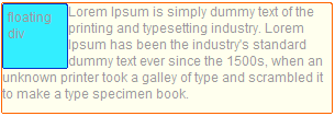
This is a very useful feature when making layout, because like position:absolute; you can place block elements besides each other, but unlike it, they can interact with each other as well. You can float two elements next to each other, and when the left element gets wider, the right element will move accordingly. Like so:
For a silly reason, Internet Explorer 6 adds extra bits of margin around floated elements. To solve this, there is an equally silly fix: just add display:inline; to the floated element and the extra margins magically disappear.. Since floated elements will always be block, this doesn’t affect any real other browsers.
Clear #
There are times when you don’t want certain content to be next to floated elements. To accomplish this, you can use clear. You can decide to clear all left, right or both, floated elements, or explicitly tell an element to clear nothing with clear:none;.
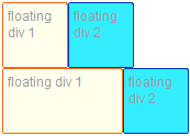
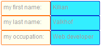
You can use these two properties together: a floated element can also clear other floated elements before it. This is useful when you have a list of two elements that you want to display next to each other, but every pair on it’s own line. (for example, definition lists or label + input combinations)
Just float all elements, and add clear:left to each first element:
.div1 {
	float:left;
	clear:left;
}
.div2 {
	float:left;
}
Will result in this image:
There are a number of rendering bugs in internet explorer 6 (the most common one is called the peekaboo bug), most of which can be fixed by making sure your elements have hasLayout, so just add a width, positioning or zoom:1 to your css.
Overflowing #
When you float an element, its parent will not scale to encompass it unless the parent element is floated itself or the inline content makes the parent element long enough. If you float an element that is longer than it’s parents element, this will happen:
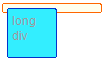
You could just tell it to encompass it. To do so, just add overflow:auto; to the parent element. Fixed:
Display:even-more! #
In the first part of this series we discussed the block, inline display modes. But CSS2 has a bit more:
- inline-block
- list-item
- run-in
- compact
- table
However as you might expect, none of them work cross-browser, and a couple don’t work at all. For an excellent overview, check out PPK’s compatibility table to see that we can pretty much forget about run-in and compact
Display:inline-block; #
That seems a bit contradictory, doesn’t it? It’s not though. An element with inline-block get placed inside flow, on the line next to other elements, but you can style it like a block element. So it can have a width and height and add margin and padding to it. This doesn’t work in firefox2 (it does in 3) and is a bit buggy in internet explorer 6 and 7: there it only works on elements that naturally have display:inline; Update: or, like NatalieMac said in the replies, by firstly declaring it to be display:inline; and then display:inline-block in another selector. IE truly moves in mysterious ways…

Display:list-item; #
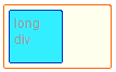
List-item works in IE6 and better, so you can feel free to use it. When you make something a list-item, you basically make two boxes: one that has a block setting for the text within it, and a “marker box”, where the dot goes:

Display:run-in; #
Run-in does not work in anything but Opera. Its description is awfully confusing, but I’ll try to translate it into more understandable English: an element with display:run-in; will be placed right in front of the next (block) element. However, If there is no block element following it, it will become a block element itself. The use for this element is being able to make run-in headers:
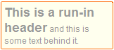
Behind the scenes, the heading in the above image actually gets placed inside the paragraph and gets display:inline;.
Display:compact; #
This value is dependent on the next element as well. Adding to the complexity however, the following will only happen if the element is less than one (text) line long: if the next element is a block element and has enough margin-left, the element with display:compact; becomes display:inline; and is positioned in the left-margin of the next element.
Adding to that, the line-height of the element with display:compact; will also be used for the first line of the block element next to it.
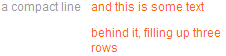
In the above (simulated) example, you can see that the line-height of the element with display:compact; (3em) is used as the line-height for the first line of the next element as well.
Display:table #
display:table comes with a couple of other display properties:
- table-row (
<tr>) - table-cell (
<td>or<th>) - table-column (
<col>) - table-row-group (
<tbody>) - table-header-group (
<thead>) - table-footer-group (
<tfoot>) - table-column-group (
<colgroup>) - table-caption (
<caption>)
The HTML equivalent is placed in parentheses. These elements do not work in Internet explorer 6 or 7, but do in all other browsers. Together, they allow you to emulate a table while using other elements.
There is also an inline-table value, which allows you to place the whole of the above in line with the rest of your content.
That’s it for CSS2! #
We’ve now covered all the positioning possibilities CSS2 gives. Tune in next week to see what CSS3 has to offer us!
Update: part three of Understanding CSS positioning is posted, check it out!
 Hi, I'm Kilian. I make Polypane, the
browser for responsive web development and design. If you're reading this site, that's probably
interesting to you. Try it out!
Hi, I'm Kilian. I make Polypane, the
browser for responsive web development and design. If you're reading this site, that's probably
interesting to you. Try it out!