(Almost) Cross browser text-shadow
Update: I have written a jQuery plugin that takes care of text-shadow in Internet Explorer, you can read the article here: Text-shadow in IE with jQuery
Text-shadow is a neat little CSS3 (actually, CSS2) property that allows you to display a shadow behind your text. The only downfall is that it doesn’t work in Firefox and Internet Explorer. I decided to fix that problem. Well, half of it. I made it work in…
Internet explorer! #
Bet you didn’t see that one coming, did you? Internet Explorer has a neat thing called “filters” which are basically filthy javascript implementations in CSS. They have a whole slew of them, including shadow. But we’re not using that because it’s very ugly:

h1 {filter:progid:DXImageTransform.Microsoft.Shadow(color=#666666,direction=45);}
See, you don’t want that in your page, you want something looking good like this text-shadow in safari 3:

h1 {text-shadow:#000 0px 0px 3px;}
This, of course, looks much much better.
Exit shadow, enter glow and blur #
When you look at the text-shadow effect in Safari or Opera 9.5, you can see that the shadow is basically a blurry version of the text that fades away at the edges. So we have to find a way to emulate that in Internet explorer. Thanks to two filters we can emulate it: Glow takes care of expanding beyond the text but is a bit crude on its own, so we add a slight blur to it to soften it up a bit.
filter:
    progid:DXImageTransform.Microsoft.Glow(Color=#bbbbbb,Strength=2)
    progid:DXImageTransform.Microsoft.blur(pixelradius=5, enabled='true')
;
When we add these filters to some text it looks nice and shadow-y, but we lose the text itself.
It gets ugly here #
In order for it to work, we need to find some way to place the same text over the blurred text. For that to happen I added an additional span inside the element.
When we keep the filters on the element, the span inside the element gets blurred as well, with no way of turning that off. So we have to switch it around: we place the filters on the span.
From here on some creativity is needed: We need to place the span directly under the original text. We do this by absolute positioning, a negative z-index and a bit of guesswork regarding the placement.
The Result #
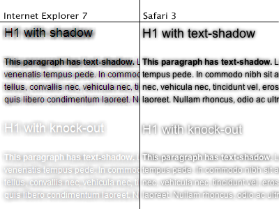
From there on I just cleaned it all up, hid the extra span for all other browsers using conditional comments, added a knock-out version and the end result looks like this:
Check out the example (in Internet Explorer), the CSS is fully commented for your dissection and understanding.
Discussion #
There are some points of discussion of course.
The Firefox problem #
If you’ve gotten till here, you might wonder why Firefox is missing from this article. That’s because it currently doesn’t support text-shadow. There is an extension available, though.
Semantics and all that #
The span’s, while nicely hidden using conditional comments, would probably be better off added with javascript, just for cleanliness. The same goes for all the proprietary CSS, add it in a special CSS stylesheet and include it using conditional comments to keep your main stylesheet valid and not bother smarter browsers with invalid CSS.
That’s it, have fun with this bit of code! (My way of saying: code in public domain)
 Hi, I'm Kilian. I make Polypane, the
browser for responsive web development and design. If you're reading this site, that's probably
interesting to you. Try it out!
Hi, I'm Kilian. I make Polypane, the
browser for responsive web development and design. If you're reading this site, that's probably
interesting to you. Try it out!