The box model is not layout
One term that keeps coming up in the design community as a stand-in for layout is “box model”, for example in “Why don’t design tools have the box model?” The CSS Box model is a well-defined term though, and it does not do layout.
If we keep referring to our imaginary perfect layout system in design tools as “box model”, we risk getting the wrong thing.
So what’s the box model then?
You might already know that in CSS, everything is a box. How these boxes are positioned on a page is layout, but the spacing around their content, with padding, border and then margin, is called the box model.
The content area of a box contains the actual content of the element, like the text or an image. Around that is placed the padding, which is the spacing inside the box. Then comes the border, which is, well, the border. This together constitutes the box, in CSS terms. Then, the margins are the spacing that is applied to the outside of the box, which can be used to separate elements from their neighbors.
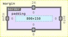
This, conceptually, is what the CSS box model is. Notice how none of this could be used to create anything but a nicely spaced single-column layout. For more advanced layouts, we need to use one of the three actual layout methods: CSS normal flow, Flex layout and Grid layout.
CSS Normal flow
Normal flow is what most people mean when they think of the way web pages are laid out. It’s how we describe the interaction between boxes.
In CSS Normal flow, each box (like above) is part of something called a “formatting context”. This can either be block, or inline. Inline ends up side-by-side, “on the same line”, and block boxes start on a new line, regardless of how much space is left on the previous line.
This doesn’t get us much in the way of layout, for that we need more advanced layout concepts. With CSS normal flow, the primary way we built more complex layouts was with float and position.
Floats were meant to provide a way to float images inside text, such that the text flowed around the image like in a magazine. Quickly, developers discovered they could also use it to create things like multi-column layouts.
Positioning then lets you take elements “out of the normal flow”, which could be useful to place elements on top of others or to always keep e.g. a heading in view.
Floats and positioning combined let us put elements anywhere on the page while still making sure elements could respond to other elements changing. That came with a lot of complexity though, and could break easily.
This doesn’t mean you shouldn’t use them anymore but for a lot of use cases, using either flex or grid is the preferred way:
Flex layout and Grid layout
All modern browsers now implement both the Flex layout and the Grid layout specification.
I won’t go into details on both of these methods. Flex layout is what you’d use if you are only interested in layout out elements in a single dimension (though, to confuse things, that dimension might run over several “inline” lines), and if you want to position things in two dimensions, you’d use Grid. This is a pretty big simplification and there is more nuance to it, but for the purpose of this article it’s sufficient.
Both are powerful ways to lay out boxes in a way that keeps them responsive to the changes of the boxes surrounding them and the boxes they’re in.
For a great rundown of the various layout methods and concepts in CSS, please check out the excellent MDN resources on CSS layout.
What do we want design tools to do?
So when we ask for the box model, what is it that we really want design tools to do?
I think we want them to behave as if their artboards or their frames had a layout engine. Where if we updated a single element, the rest of the elements would be updated to “reflow” depending on the changes, and all of the tedious moving of elements across all artboards would be done for us.
Stacks and smart layouts help us with this for smaller elements, like components or symbols. Conceptually they’re similar to (a less powerful) Flex layout. But that’s just not enough, especially when you factor in multiple artboard for responsive design.
We want design tools to operate with a full layout engine, and that is not (just) the box model.
Addendum #
Of course there are design tools that do have a full layout engine, and I’ve named a few in previous posts. The “big three” of design tools (Sketch, Figma and Adobe XD) don’t have a full layout engine, and that’s where most requests are aimed at.
 Hi, I'm Kilian. I make Polypane, the
browser for responsive web development and design. If you're reading this site, that's probably
interesting to you. Try it out!
Hi, I'm Kilian. I make Polypane, the
browser for responsive web development and design. If you're reading this site, that's probably
interesting to you. Try it out!