Beautiful CSS 3D Transform Examples
CSS 3D transforms create depth and visually interesting elements on your page using perspective. I use them on the Polypane website and whenever I see them in the wild they look fun and clever. Unfortunately I don’t see them being used a whole lot.
Maybe that’s because it’s not well known you can do proper 3D transforms, or if they’re difficult to “get right”, between understanding the coordinate system, whatever “perspective” means, and strange issues across browsers, but I wish people used them more.
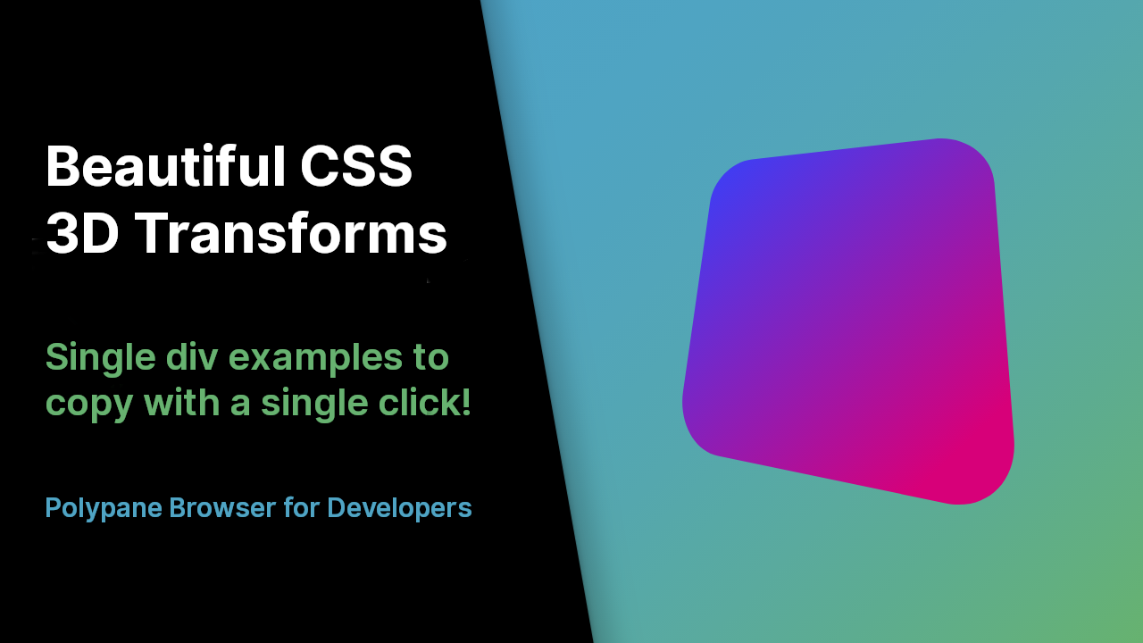
So I collected some of the most interesting ones I could find, rewrote them so they only need a single div and made a list with a live example and the CSS side by side.
It’s hosted over on the Polypane website, here’s the direct link: Beautiful CSS 3D Transforms.
Some of the examples are interactive and each CSS example comes with a copy CSS button for easy copying. If you have suggestions for additions to the list let me know!
 Hi, I'm Kilian. I make Polypane, the
browser for responsive web development and design. If you're reading this site, that's probably
interesting to you. Try it out!
Hi, I'm Kilian. I make Polypane, the
browser for responsive web development and design. If you're reading this site, that's probably
interesting to you. Try it out!