Design tokens 101
Yesterday, I gave a âš¡ lightning talk on design tokens at the @ReactAmsterdam meetup. I’ve been to a few React Amsterdam meetups and there’s always a really good vibe so I was really happy I got to do a lightning talk on a subject I care about. There were about 200 people in the room and it was again a really nice crowd.
The presentation got recorded, but some of the audio and first slide seems to have been cut off. Watch it here or scroll down to read along with the slides. The video starts at my talk but the preceding talks by Dmitry and Sid and the other lightning talks by Melanie and Guus are really good too, so watch all of them.
Design tokens 101 #
Hi everyone, I’m here to give you an intro to design tokens
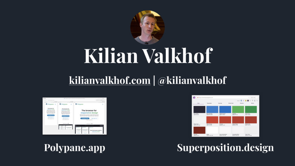
My name is Kilian, and I make tools for developers and designers, usually with React. The two apps that I’m working on right now are Polypane, a browser for developers (ask me about that after the presentations), and Superposition, which is why I’m here talking about design tokens. Superposition is a free app that lets you get started with design systems by extracting design tokens from your existing website.
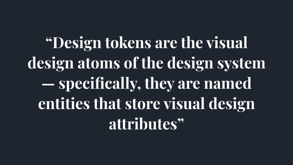
So, design tokens, what are they? “Design tokens are the visual design atoms of the design system”. Great, but what does that mean? With design tokens you can describe low level values and use them to create the styles for your product. They help create a scalable and consistent visual system for UI development.
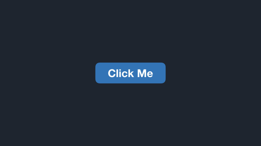
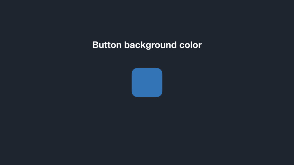
And if we look at the design elements of a design system, there are many properties that you want to use tokens for. Take for example this button.
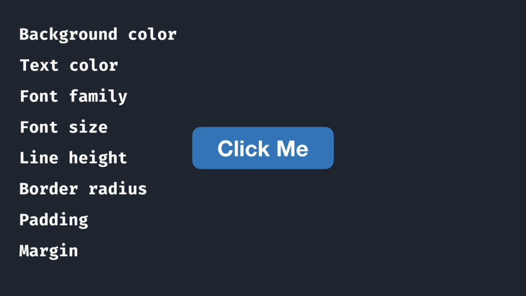
As you can see, even for a simple button there are tons of things we can encode in a system. There’s background and text color, font properties and things like border radius and spacing.
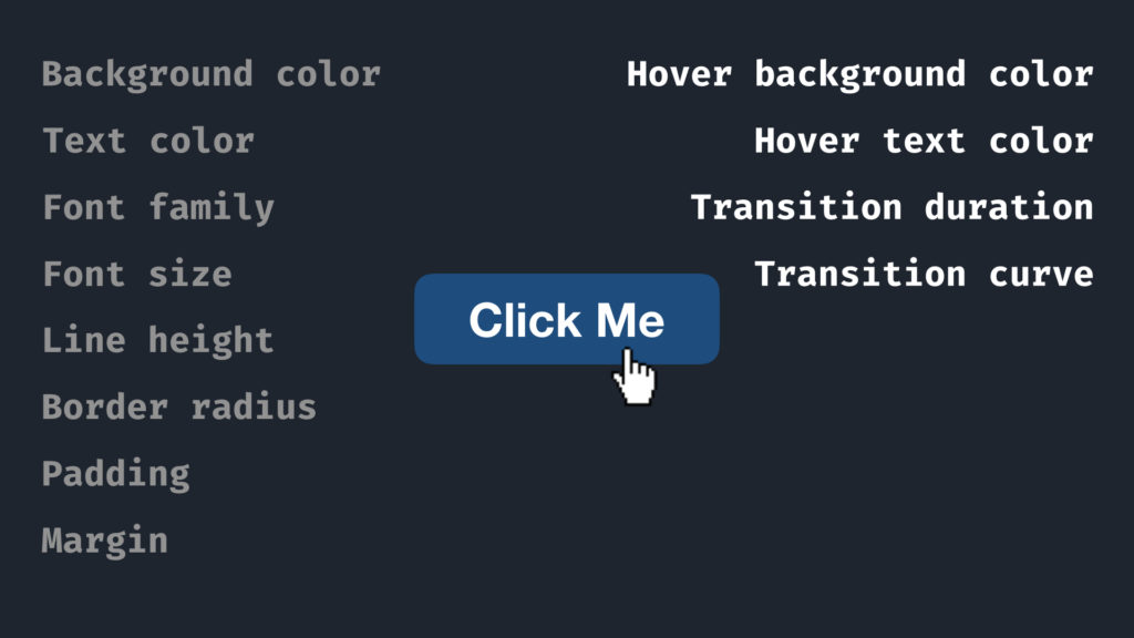
And buttons also have multiple states, for example a hover state. That adds additional hover background and text color, and if you animate those with a nice transition, then the duration and the transition curve are both values that can be part of your design system too. And there’s even more than just these, like breakpoints, border styles, letter spacing, shadows and z-indices.
The question then becomes, are design tokens just …variables? First off, they’re more like constants. And you want them to be technology agnostic. They can be a javascript object, like we saw in the previous talk, but they can also be written in json or yaml, or anything else that makes sense for you. That file can then be used in many different places. You could export that file from your design tools, or import into design tools, so everyone uses the same design primitives. That way, you’re no longer relying on the ability to remember hex codes, or hope your designer selects the right pixel when you ask for one.
These design tokens should be the basis on which you build your components. In other words, they’re a way of dealing with values in a way that helps everyone use the same style consistently.
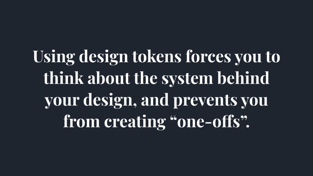
Using design tokens forces you to think about the system behind your design and prevent you from creating “one-offs”. Systematizing your design makes creating new components and designs faster and more consistent, because it moves design choices away from your component and into the system, where choices can be made in a larger context and only have to be made once
So rather than thinking of design parts as single things, we think of them as a system. Our button background color for example, is probably part of a scale
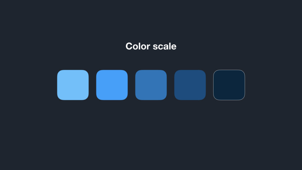
…like this.
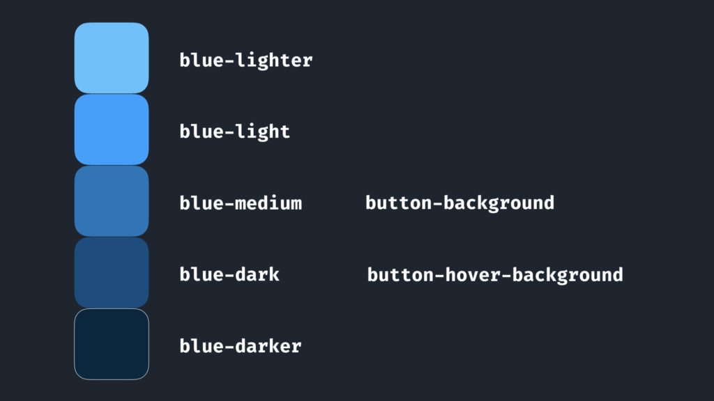
But probably more like this. The tints in your color scale have names. Common naming schemes are like this with light, lighter and dark, darker, or using a numerical scale like blue 100, blue 200 all the way to blue 900. That’s more flexible, it allows you to add 999 tints, if you need them.
Additionally, by giving them names, you can also impart additional meaning on them. If you’re creating a new button and you have to remember whether it used blue-medium or blue dark, or have to look it up in some other component, that wastes time and can lead to inconsistencies. If we add an additional layer of design tokens that references other design tokens, and give them meaningful names like button-background and button-hover-background, then we no longer have to remember which specific tint we use, we can just use the token button-background.
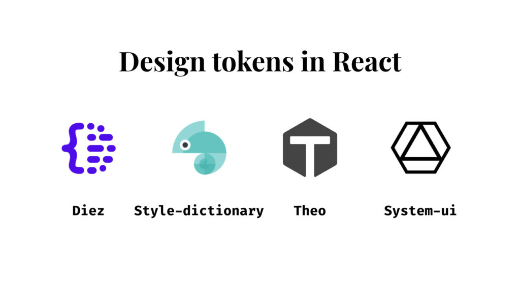
Design tokens in React: There are many different tools to work with design tokens and most are platform agnostic and work great with React. Here are a few of them and as you can see all of them have really good logos. So try them out for yourself and see which one you like best.
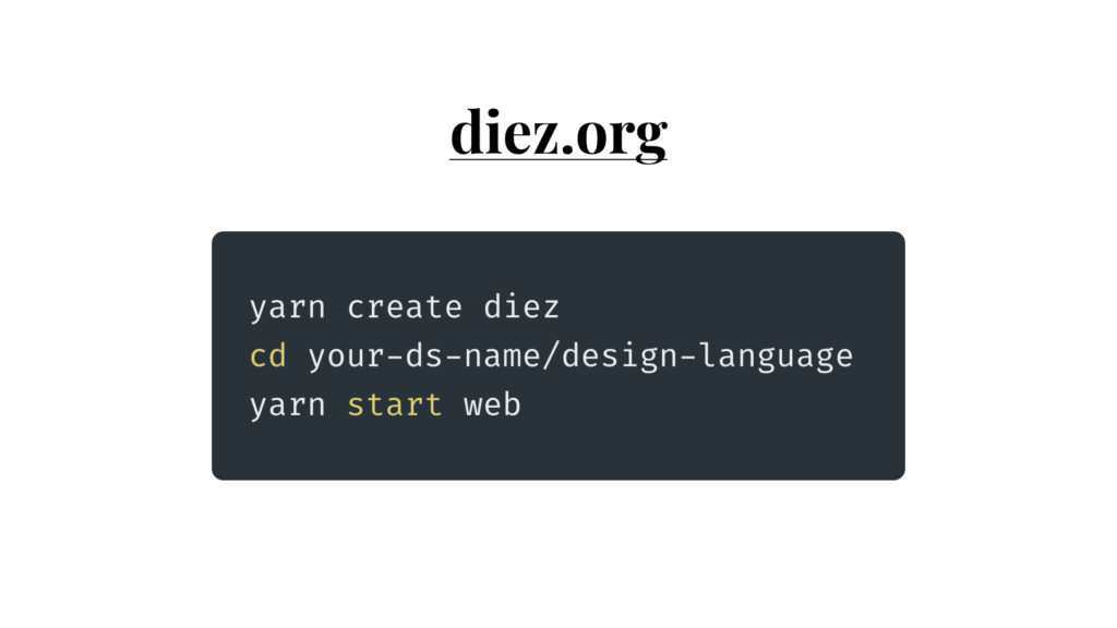
I’m going to give a quick demo using Diez. I won’t do it justice at all since I don’t have the time for that, but I picked Diez because it’s easy to get started with and can get design tokens directly from your design tools.
These three commands will give you an example design language file, with React and SCSS example code and a hot reloading server
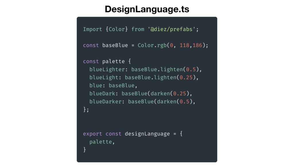
In the DesignLanguage file, which is a typescript file, you can describe your design tokens. Here I’ve added the blue tints that we just saw and export them, so we can use them in our React app.
Your DesignLanguage file can contain anything. Colors, fonts, sizes, images and even texts, so this is just a simple example.
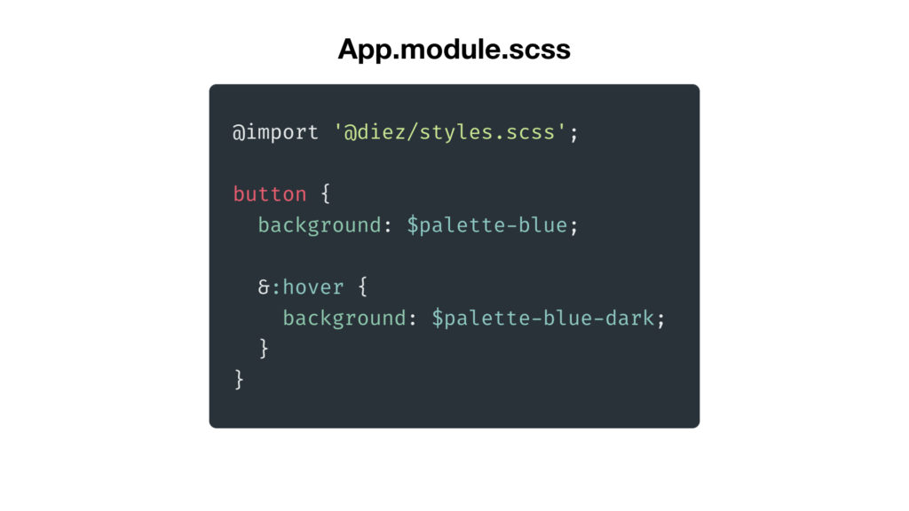
Then if we want to use that in our SCSS, we import the generated file and use the design tokens defined in it. This imported file will be regenerated when we update our designLanguage file.
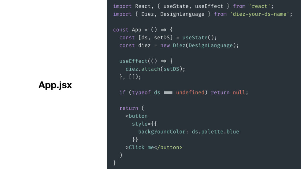
Then on the react side the example is a bit more involved. You can import the design system file and what it does is it supports hot reloading so you can work on your design system and have your react components update along with it.
There’s much more possible, like exporting your design tokens from Sketch and Figma, and using them in other languages like Swift and Kotlin. Check out the Diez website for a more in-depth intro than I have time for now.
Diez is just one way to describe tokens, and the other tools I showed have their own way. All of them are also part of the Design tokens community working group. The working group is defining a standard format for documenting and using design tokens that is interoperable, so all tools can import and export the same way.
Along with these design tokens tools, companies like Adobe, Sketch, Google and many more are participating in this process. It’s still early days and your opinions are welcome, so check out the link to help out.
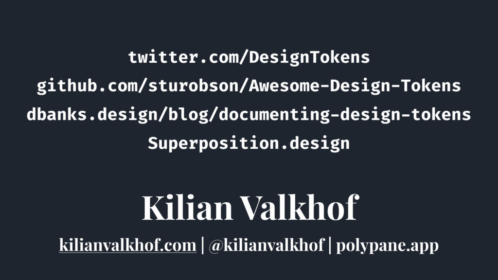
Lastly, this is just a really short introduction. For more on design tokens, check out these links:
- twitter.com/DesignTokens
- github.com/sturobson/Awesome-Design-Tokens
- dbanks.design/blog/documenting-design-tokens
- superposition.design
And thanks for listening!
 Hi, I'm Kilian. I make Polypane, the
browser for responsive web development and design. If you're reading this site, that's probably
interesting to you. Try it out!
Hi, I'm Kilian. I make Polypane, the
browser for responsive web development and design. If you're reading this site, that's probably
interesting to you. Try it out!