How I built my own browser
Building your own browser sounds like a terrible idea, especially if you’re a front-end developer by trade and don’t know any C++ or other native language. Even so a couple of years ago I decided to see if I could and by now my browser has developed into a serious project.
How’d I get the idea?
In 2015 I decided, like many other web designers and developers, to switch from Photoshop to Sketch. I adapted to it very quickly, especially to the way Sketch artboard work. These artboards could be placed side by side in any configuration you wanted. Very quickly I developed a layout of all the responsive variants of a design shown alongside each other, giving me a really good overview of what I was designing.
…Until I went back to a browser to implement those designs. There all I could see was a single viewport at a time. I was constantly resizing either my entire browser, or the responsive design tools and that was so slow. There was no way to quickly compare two responsive sizes and compared to Sketch, it felt very poor.
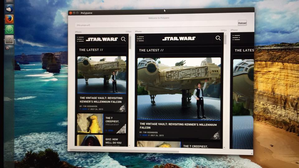
Around the same time I was playing around with Electron, a framework that allowed you to make desktop applications with web technologies. I decided to develop a prototype that allowed me to see the same website in multiple viewports side by side just like my layout in Sketch. After a few nights of writing code I had something that already worked pretty well:

You couldn’t really do a lot with it but you could fill in a URL and it would be shown at multiple screen dimensions. Pretty cool!
Electron turned out to be a good choice. Not only did it allow me to use my existing knowledge of web development to make a ‘real’ browser, but that browser also used an up-to-date version of Chromium and the Chromium developer tools. So even though you always need to test in multiple browsers, I wouldn’t have to worry that certain web technologies wouldn’t work in mine. I could also still use the Developer tools I was already accustomed to.
I started using the prototype for my job as a front-end developer and very quickly discovered that I could implement designs significantly faster because I no longer was managing my browser size all the time. All I needed to do was focus on the site itself. This streamline process quickly saved me hours of work per week.
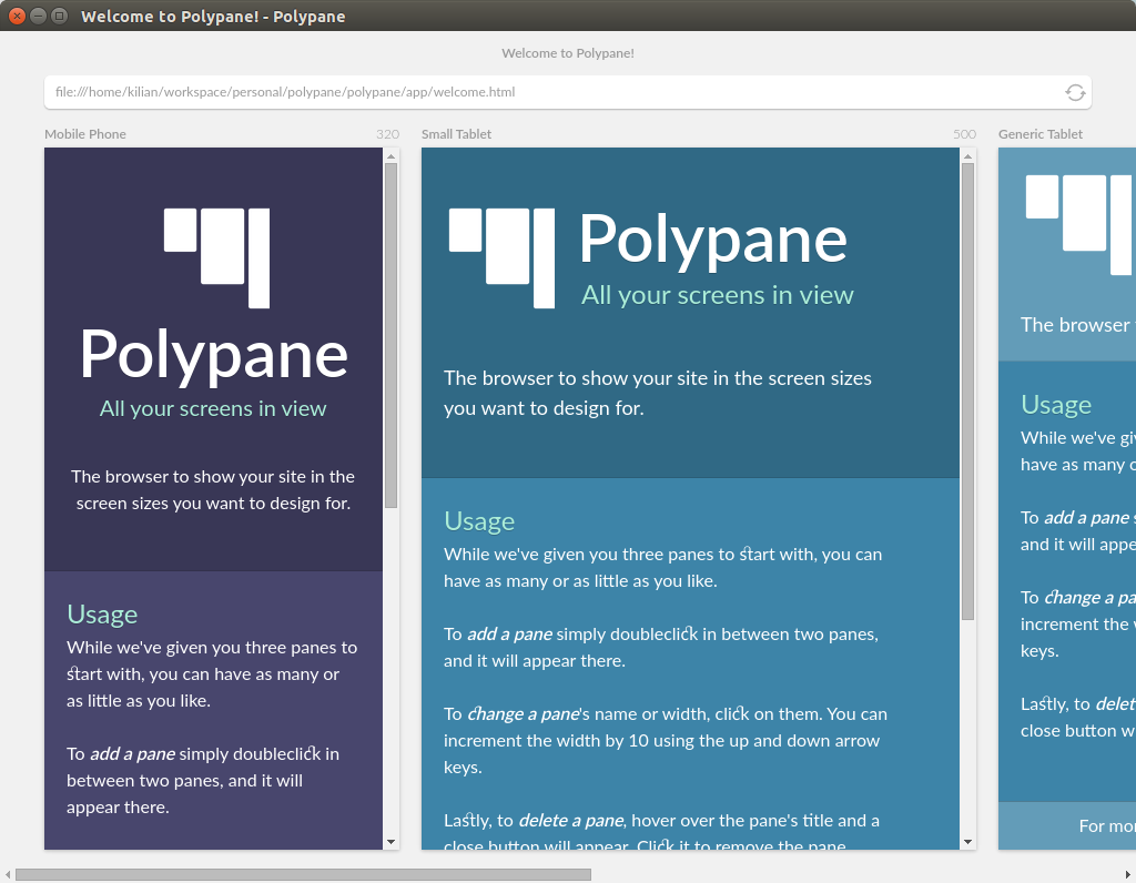
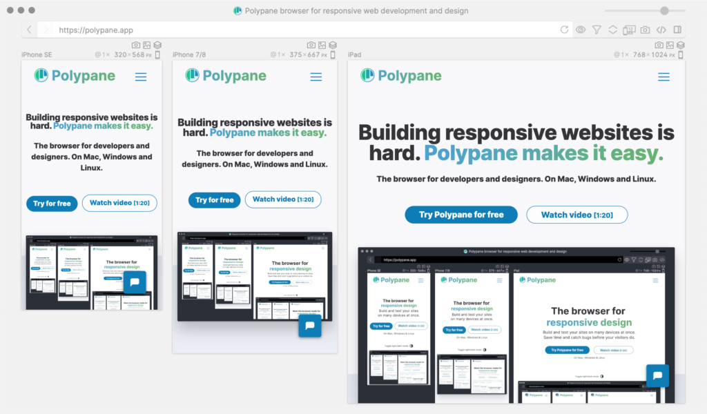
By using it myself I also discovered all the things I was missing and quickly started adding more features. Some were “normal” browser features like navigation (That’s right, the prototype up till now had no forward and backward buttons) and showing the page title. Others were improvements of my multi-screen approach: the ability to add new screens and resize them and the ability to make a screenshot of all screens side-by-side, ideal to send to your client.

I decided then to share the browser with other developers and quickly began adding new features based on their feedback: The ability to zoom screens in and out, like how you can easily do that in Sketch too, standard screen sizes based on popular devices, and syncing user interactions like scrolling and hovers between all screens so that what you did in one screen was applied on all of them.
Continued development
With each new feature I added I started questioning more and more why other browsers don’t offer this. But Chrome, Firefox & co are not made for developers. There are many, many more regular users that never need developer tools. Secretly, developers are a tiny target audience for regular browsers and while the developer tools in them are amazing, the rest of a browser just doesn’t take developers into account.
Because of the feedback I had gotten I realized how much better a browser could be for front-end developers if the entire interface was geared towards the work they do. This is why I decided to offer my browser as a serious product. Since the beginning of last year I’ve been working on it full time, implementing my own ideas and the suggestions I get from my users. Many new features came from that, like full page screenshots, built-in live reloading and device emulation.

Browsers can be so much more
Browsers can do so much more for front-end developers. A browser has a ton of information about a website that is relevant to the developer working on it but that information is not shown anyway. Things like the various responsive sizes that are being used in the CSS. If there are many or they’re very close to each other then you can drastically reduce the size and complexity of your styling, making your CSS more maintainable.
A lot of functionality that we as front-end developers now use through all sorts of little scripts and separate apps — like live reloading, comparing your site to a signed-off design or doing layout debugging with something like Pesticide — are much more accessible and easy-to-use if they’re implemented directly into the browser.
A browser also knows a lot about how accessible a site really is. Missing ALT texts, incorrect headings and insufficient contrast between text and background are all problems that your browser knows about or can calculate. And as renderer a browser can simulate things like color blindness or other visual impairments.
Good accessibility is at least as important as a beautiful responsive design and by adding the features I just mentioned prominently in my browser I hope that developers will discover them more easily and use them more often. They no longer already have to know you can simulate color blindness or that you can use live reloading to never have to press the reload button again. Because the browser has these features, developers will see them and use them.
The feedback I’ve gotten so far seems to prove that: many users tell me they either didn’t know you could test for color blindness or didn’t because their browser never made that easy.
Of course, my browser is not the only one. Firefox too has recently added really nice accessibility features. Unfortunately those are “hidden” in a tab in the developer tools meaning they’re hidden to developers that don’t already know they’re there.
Apart from these functionalities there are many things that are important for developers that you can’t see or have to dive deep into the developer tools to find out. What about a clear overview of your cookies and localStorage? Or information about your HTTP connection. Perhaps every link on your site actually is a 302 redirect because the way your client-side and server side handles slashes isn’t consistent. As a front-end developer this is information you want to know: Every 302 makes your site a few milliseconds slower and they add up.
As you can see, I have plenty of work to do in 2020 going forward.
Building your own browser: a bad idea?
After having done it I can say: …yeah, a little. But I ended up building something and working daily on something that I’m incredibly proud of and that many people benefit from on a daily basis.
The front-end development workflow has become significantly more complex in the last few years and sometimes it feels like things change daily or even hourly. That means it’s easy to feel overwhelmed or to just chase every new thing without thinking about how you can actually use them to make your own workflow better. Improving your workflow — for example by using a browser that supports you in your job — can easily save you hours a week. And that’s not bad at all.