Prefers-contrast: forced is a mistake
CSS Media Queries Level 5 is coming and though it’s still heavily in progress, there is a particular new option that feels like a mistake in the making to me: prefers-contrast: forced. I’ll explain why I feel that way in this article.
24 Feb 2021: prefers-contrast: forced has been removed from the specification! Read the Update at the end of this article.
Sometime later in 2021: They snuck it back into the specification as prefers-contrast: custom, which is even less descriptive.
What does forced mean?
There is an existing media query, forced-colors: active, supported on Windows by Edge (and in IE as -ms-high-contrast), that evaluates to true if Windows is in High Contrast mode. If you are unfamiliar with High contrast mode, this is what it does in short: it overwrites all colors to a limited set of user selected colors. It also adds backgrounds (“backplates”) to any text that sits on top of images.
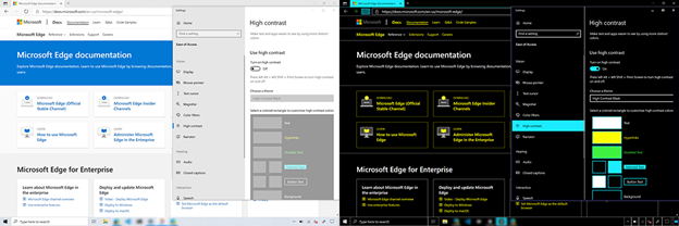
This can help immensely with readability, and the media query will help you style additional elements (like SVG icons) to fit with the design, and also to selectively turn forced colors off, for example when color in your UI is significant.
Though it is called “High Contrast”, the key here is that it’s user selected colors. There’s a few built-in themes that are all high contrast, but the same feature can be used to dim all the colors for people with photophobia or blue light sensitivity. There is nothing forcing (ahem) the end result to be high contrast.
A quick primer on prefers-contrast
prefers-contrast is used to indicate if users prefer high or low contrast. Contrast in this context is the color contrast between adjacent colors (for example, text versus background colors). There is no browser support yet, though Chrome, Edge and Firefox all have it internally already. For a larger overview check out my article Beyond screen sizes: responsive design in 2020.
Why would someone prefer low contrast? You, the reader, probably dim your screen at night, or use a blue light filter. Those both lower contrast. There are also people that dim the brightness of their screen to prevent triggering migraines as well as the photophobia and blue light sensitivity I mentioned earlier.
This feature is not set in stone yet. Instead of high and low it might become more or less. And high might be split into two values: high (as supported on Windows) and increased (as supported on macOS). where increased will match for high as well.
One of the proposals is to have a new value, forced, which will make prefers-contrast: forced behave the same as forced-colors: active. Here are the reasons I found for this:
- The vast majority of
forced-colorsusers use it to force high contrast. (Though not all, as mentioned.) - Authors (that’s us web devs) would not have to add support for
prefers-contrastandforced-colorsboth, which they might not do. Having just to supportprefers-contrastputs less of a burden on us. - You can also check for just
prefers-contrastwithout a value, which will match both thelowandhighvalues and also theforcedvalue. I do not understand the value of this. Surely increasing contrast for someone that wants low contrast, or decreasing contrast for someone that wants high contrast is not a good thing. I feel like I’m missing something here even outside of theforcedkeyword.
Regarding that last point, in reading the discussions on the GitHub issues about this I noticed there might be some confusion about “contrast”. Some people see it strictly as the color contrast, which is what the current working draft says as well, whereas other people see “contrast” in the context of “stuff on the screen”, and argue that removing stuff from the screen (complexity) is good in both the high and low contrast preferences.
If prefers-contrast is not about color contrast, the argument about removing complexity makes sense, but as it stands the Working Draft explicitly mentions color contrast.
The issues I have with the forced exist on both sides of the colon:
My issue with the media feature prefers-contrast
The prefers-* prefix for media queries to me indicates a media query that expects me to do something about it. This in contrast to other media queries, that are a signal that something already is.
For example: the width media query is something that already is. I can not change the width of the viewport, I just have to take it and respond to it.
With prefers-* however, nothing has happened yet. It’s my responsibility as an author to make sure something will happen, if I choose to respond to this user preference.
Adding forced as a value, which indicated something has already changed (literally all the colors), breaks this user preference convention. This makes it harder for authors to learn CSS and anticipate what’s going to happen.
(No, having to learn a single exception is not a problem. But it does mean that the convention in general no longer matters, and that is a problem.)
My issue with the value forced
As noted in the Microsoft article linked above, High Contrast mode is a misnomer. forced-colors maybe says something about wanting high contrast for most users (citation needed) but this is not an absolute truth.
Pretending forced colors are always high contrast by conflating it with prefers-contrast does a disservice to anyone using forced colors to help with for example photophobia or blue light sensitivity.
This will lead to authors using prefers-contrast: forced (and prefers-contrast without value) as a blunt weapon to force high contrast upon users that have configured their entire OS to be low contrast. This seems like adding insult to injury with the justification that this is easier for authors.
In the situation where a user has configured their forced colors to be low-contrast sepia tones (for reduced blue light), the last thing you want to do is force a high-contrast.
There is also the issue of what should a CSS author do with forced colors? The examples given are about making sure parts of your page that haven’t already been changed are made to adhere to the forced colors, and for parts of the page where the original colors are important to be reverted.
On the other hand, for users that want high contrast you will probably want to add cleared borders and other delineations, remove things like gradients and box shadows (something that forced-colors already does anyway) and for low contrast you’d probably want to dim full white and lighten full black colors, for example.
forced may match prefers-contrast: high or prefers-contrast: low, but it doesn’t have to.
It should be noted that the spec indicates that, when programmatically determinable, forced colors should also resolve prefers-contrast: high or prefers-contrast: low to true (although the likelihood of browsers implementing this is probably low).
More importantly though, what are you going to do with regards to the contrast if all the colors have already changed to the preferred contrast levels of your user?
What happens for people that naively check for prefers-contrast: forced or indeed prefers-contrast? Are they not far more likely to do the wrong thing? The specification calls out to only use this to remove visual clutter, sure. Most authors never read the specification though, but will take the media query at face value.
As an author, I do not see this hypothetical benefit. The issue of authors choosing to implement just some user preferences is a relevant one, but if you take a look at what authors need to do in response to user preferences, finding a combined value for prefers-contrastand prefer-reduced-transparency feels like a bigger benefit.
Existing duplication with forced-colors
forced-colors is not going away. It’s implemented and in use and has exactly the right semantics for what it needs to do: Give authors the indication that colors have already changed and now we need to make sure the parts of our site that need to be original colors can be adapted, as well as adapting other parts of our site to the forced colors being used.
Contrast does not come into play for what authors need to do to respond to forced-colors. The fact that for the majority of cases using forced colors leads to increased contrast has no effect on what authors do in their CSS stylesheet.
In summary
prefers-contrast: forced breaks the prefers-* convention, the forced value doesn’t actually have to say anything about contrast, there are no significant contrast-related things an author needs to do to respond to forced colors and there is already an implemented alternative with the right semantics.
In short, I think prefers-contrast: forced is a mistake and I think it will end up on the incomplete list of CSS mistakes at some point in the future.
A new media feature: prefers-reduced-complexity
While I’m not sure that it’s wise to take a bunch of preferences and then say they all prefer less visual clutter, given that the spec writers have this intent I think a more explicit name is better.
Instead of overloading the meaning of prefers-contrast I would propose a new boolean-only CSS Media feature called prefers-reduced-complexity that would be true if any of the following is true:
prefers-contrasthas any value other thanno-preference.prefers-reduced-transparencyis set toreduce.forced-colorsis set toactive.
This could then be the “simple” media feature to check for that matches all situations where reducing onscreen complexity is probably a good idea, and we can use the specific media features for their specific purposes.
Update 24 feb 2021
The CSS working group voted to remove prefers-contrast: forced from the specification, a result I’m very pleased about. You can re-read the proceedings here: [mediaqueries-5] duplication of forced-colors: active and prefers-contrast: forced. The discussion featured this article (!) and there is a new discussion on a prefers-reduced-complexity-style media query here: [mediaqueries-5] Remove (prefers-contrast) as a boolean, and replaced by a new color reduction media query. I’ll be keeping an eye on this.
Thanks Hidde and Eric for providing feedback on this article.
![]() Hi, I'm Kilian. I make Polypane, the
browser for responsive web development and design. If you're reading this site, that's probably
interesting to you. Try it out!
Hi, I'm Kilian. I make Polypane, the
browser for responsive web development and design. If you're reading this site, that's probably
interesting to you. Try it out!