Cross-browser text-shadow
With my discovery of almost cross browser text-shadow something kept nagging me: It didn’t work in Firefox. A couple of days ago I went back to my experiments and succeeded in a reasonable looking text-shadow effect in Firefox. What’s more, In some configurations I can even make it look 3D!
Rationale #
Before we delve into the code I want to give you a little insight into how I came up with this text-shadow implementation. What a text-shadow basically is, is a blurred version of the text placed behind it (with or without a slight offset). This idea helped me implement text-shadow in IE by using the glow and blur filters it has.
For Firefox I had to go one step further. Firefox doesn’t offer glow or blur filters, So I had to rebuild them in another way. A blur, in essence, is the same image layered over itself for a number of times while expanding and with decreased opacity.
With this knowledge I set out and started experimenting in Firefox. The solution I came up with isn’t as clean as the IE solution, and by far not as clean as native text-shadow support. But it works, and that’s the point.
The implementation #
What it basically entails is: A text, an awful lot of spans, absolute positioning and opacity.
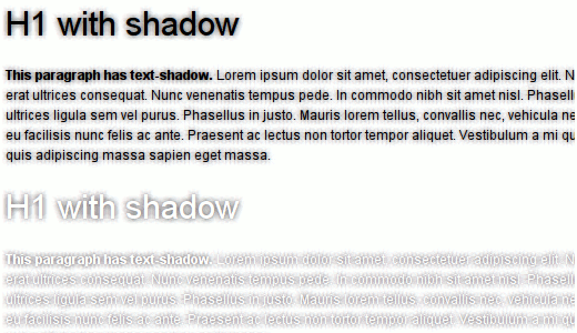
View the text-shadow example here. Or if you’re not using Firefox, here is a screenshot:
For each ‘layer’ of blur surrounding the text, I need 8 spans: one for each direction (top, left, bottom, right) and one for each combined one (top-left, top-right, bottom-left and bottom-right). I have chosen an arbitrary opacity level of 0.03, mostly because it looked better than the other options (YMMV)
This works until the lasts layer (which depends on your blur level. 4px blur = 4 ‘layers’ etc.) where you have a little trick to make it look better. The directional offsets extend one pixel more than the combined directional ones, giving a slightly sharper and better looking shadow.
You might say that it doesn’t look nearly as good as real, anti-aliased native text-shadow and you’d be right. But it looks fairly close and certainly looks good enough to be used.
Spans #
All this markup cruft leads to problems when copying text: lot’s of duplicates. Using a bit of proprietary CSS we can prevent this: -moz-user-select:none;. Read more about it at Mozilla’s CSS reference. You will still have duplicate content when using CTRL+A which is a drawback but not one I have a solution for.
3D text-shadow! #
During my playing around with getting the looks right, I added a font-style:italic; to the <spans> and to my surprise it suddenly looked like this:
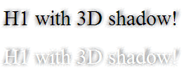
View the 3d-text-shadow example here
It looks like the text is standing on a plain and casting a shadow on it, quite neat in both the ‘regular’ and the knockout text-shadow effect. The effect seemed to work because the font-style:italic;‘s offset was located at the bottom middle.
…or not #
As it turns out, the effect only works because of the font (times new roman) having a particular width for it’s italic’s. The effect doesn’t work with any other fonts, sadly.
Where to go now? #
I’ve developed a way to display text-shadow in IE and in Firefox, the only two major browsers that don’t support it yet. But in order for it to be really useful and not just a gimmicky proof-of-concept I plan on writing a jQuery plugin that does all the dirty handwork for you and sends normal text-shadow CSS to browsers that have it, the above implementation to Firefox and my IE text-shadow implementation to IE.
While I know these implementations are far from optimal and should be used sparingly, this should help you develop cool sites until Firefox 4 and Internet Explorer 9 (or 8‽) support text-shadow.
 Hi, I'm Kilian. I make Polypane, the
browser for responsive web development and design. If you're reading this site, that's probably
interesting to you. Try it out!
Hi, I'm Kilian. I make Polypane, the
browser for responsive web development and design. If you're reading this site, that's probably
interesting to you. Try it out!