Yesterday on Mastodon we had a short discussion about the (terribly named) overflow media feature. Because it has the same name as a CSS property it’s easy to think it has more power than it really does. Underlying that is the issue that your page can’t change the value of a media feature: media features […]
Do you know about overflow: clip?
You probably know overflow: hidden, overflow: scroll and overflow: auto, but do you know overflow: clip? It's a relatively new value for the overflow property, and with Safari 16 being released later this year all evergreen browsers will support it. So what does it do?
Before diving into clip, lets quickly go over what overflow and its values do.
A quick refresher on overflow
The overflow property lets you control how content that overflows a block element should be displayed. It had four different values:
- visible: The default value: any content that overflows is visibly rendered just where it would be if the block element was larger.
- hidden: The content is clipped to the element and overflowing content is hidden.
- scroll: The element is made into a scrollable area with scrollbar, regardless of whether the content requires it.
- auto: Depending on if the content fits or not the element gets a scrollbar. Often times You want overflow: auto, not overflow: scroll.
So far, so good.
While overflow sets the overflow value for both axis, you can set a different value for both the x and y axis with overflow-x and overflow-y or with overflow-inline and overflow-block if you want to use logical properties.
overflow is also a shorthand that also allows for two values: the first for the x direction and the second for the y direction. overflow: hidden scroll will hide any horizontal overflows while adding a scrollbar for the vertical direction.
Setting two different directional overflows would let you configure your element such that it (for example) only scrolls in the vertical direction while wrapping text and hiding overflows in the horizontal direction, a common requirement.
But it turns out, they have a hidden dependency: You can't have one axis be hidden in any way (hidden, scroll and auto all limit the content from expanding beyond the element) while having the other one set to visible:
See the Pen
Overflow: Clip example by Kilian Valkhof (@Kilian)
on CodePen.
That limits the type of design you can implement without adding additional HTML to style.
Enter Clip
Clip was added for a particular reason: an element with overflow: hidden could still programmatically scroll (just not as the result of a user interacting with it). Keeping the scroll area around means that the UI still could end up being scrolled, and because it was a scroll area, it also prevented the non-scrolling axis to be set to visible. Without the scroll area, that limitation is no longer there.
So while you might not care about something being a scroll area or not (and to be frank, there's few situations where that distinction really matters) using clip means the limitations that a scroll area has no longer apply: You can clip in one direction while keeping your content visible in another direction.
This enables a number of interesting features, as well as making some designs easier to work with because you're no longer having to deal with the scroll areas:
See the Pen
Untitled by Kilian Valkhof (@Kilian)
on CodePen.
As a more practical example I've used this on the Polypane homepage to prevent an image from expanding horizontally outside of the viewport (by adding an overflow-x: clip) to its wrapper, but allowing it to expand beyond the element vertically (with overflow-y: visible) to create more depth without the image influencing the layout.
Here is a screenshot of the exaggerated effect. The pink outline is the element with a horizontal clip but vertical visible value for the overflow.
In the image you can see that the Polypane UI and its shadow on the right side expands beyond the border on the top and bottom of the element, but is neatly clipped on the right side.
Browser support
Clip has had support for quite a long time in all browsers except Safari, but support has landed in the Technical Preview for Safari 16, which should be released later this year.
Testing for support
Because overflow: clip is not yet supported in Safari, you'll want to test for support for it:
@supports (overflow:clip) {
 /* safe to use overflow: clip */
}
As a fallback for the overflowing image and shadow on the Polypane site I've deemed it acceptable to add extra padding and a negative margin to make the wrapper element higher, then pulling the next element up over it with the negative margin. Open the Polypane site in Safari to see it for yourself.
Some eagle eyed viewers would be able to see the last bit of the shadow being cut off. For me that's acceptable in exchange for keeping the rest of the styling manageable: negative margins aren't a thing I want to use all over the place.
Likewise for your implementation there could be ways to circumvent the need for clip, or provide a non-perfect but acceptable alternative.
Overflow-clip-margin
There is one more CSS property that works with overflow: clip and that's overflow-clip-margin. This property lets you control how far from the elements edge the clipping begins. By default it begins right at the edge, but you can expand beyond it:
See the Pen
Overflow: Clip with overflow-clip-margin example by Kilian Valkhof (@Kilian)
on CodePen.
This gives you even more control over where content is rendered separately from the layout it is contained in.
Can I use currently says it only works in Chromium but this is wrong. It works fine In Firefox and in fact it works better in Firefox, because it lets you set a clip margin on a single axis. In Chromium this only works when both axes are set to clip. (Thanks to @KonstantinRouda for letting me know). This means the above example currently only works in Firefox.
To read more, check out the MDN documentation on overflow and overflow-clip-margin.
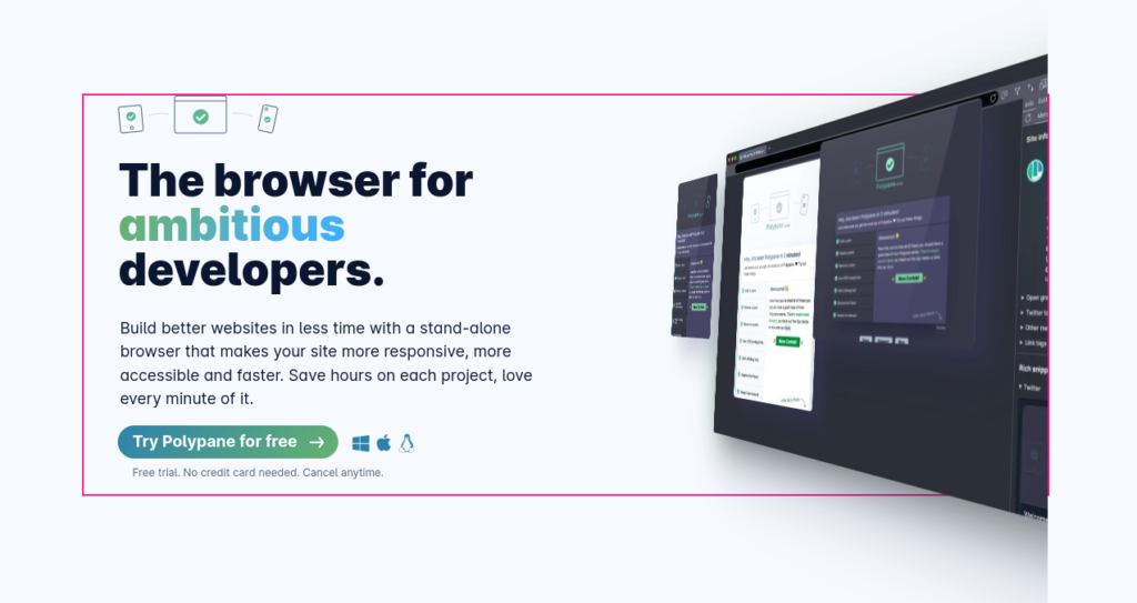
 Hi, I'm Kilian. I make Polypane, the
browser for responsive web development and design. If you're reading this site, that's probably
interesting to you. Try it out!
Hi, I'm Kilian. I make Polypane, the
browser for responsive web development and design. If you're reading this site, that's probably
interesting to you. Try it out!